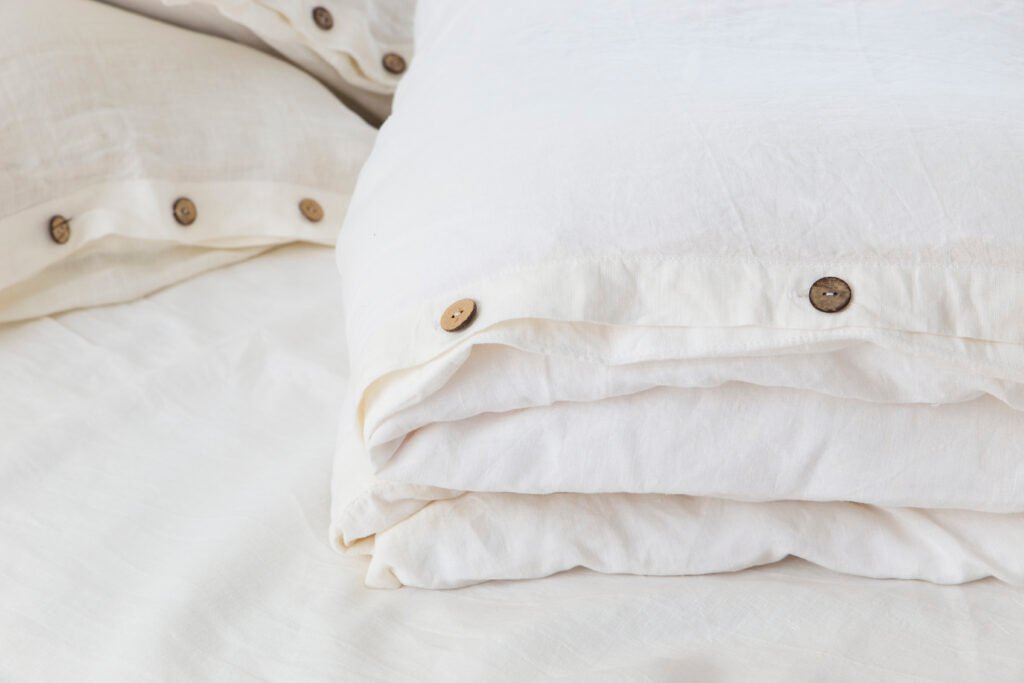
For the longest time, I also fell for the trend of having everything white and beige. Back then, I loved it, it felt fresh, minimal and stylish. But lately, I’ve been drawn more and more towards color. I want to decorate with colors.
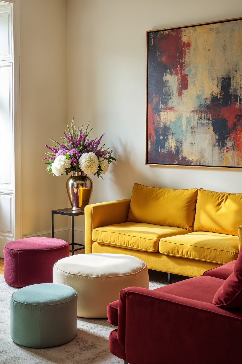
And honestly, adding color can completely transform a home. When I first started bringing in a few colorful touches, like pillows, candle holders, plants, and bedding, that’s when my home finally started to feel alive. Before, it looked nice but a bit sterile, with everything beige and a few touches of black.
Of course, that’s just my personal preference, you might love the beige aesthetic. But I have a feeling you’re a bit curious about color too, otherwise, you wouldn’t be here, right?
So, if you’ve ever wondered how to decorate with colors without making your home look chaotic or mismatched, this guide is for you. I’ll walk you through everything: from understanding color theory and undertones to creating color palettes and following (or breaking!) color rules.
1. Why Decorating With Colors Matters
Well, color doesn’t just make a space look pretty, it changes how you feel in it as well. It can actually make you happier. At least that’s what happened to me when I started adding color.
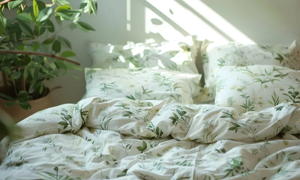
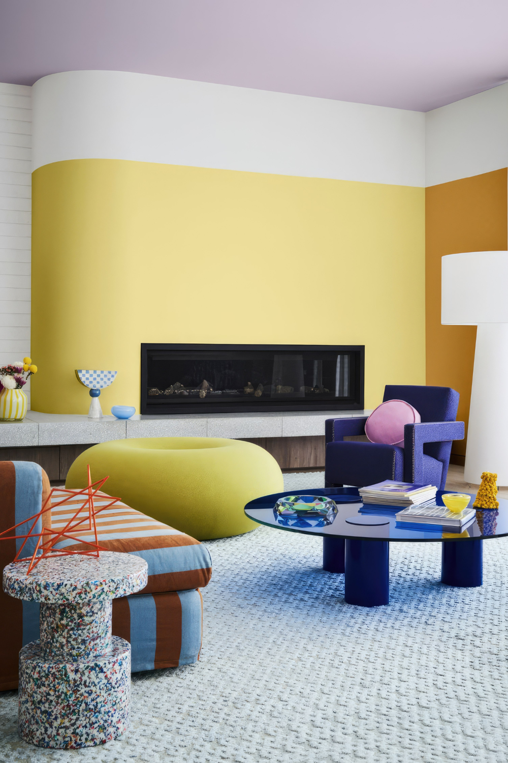
I don’t really want to admit it, but I did fell for the beige home because of the trend and now I might be falling for a trend again. Because, in 2025, interior color trends are shifting more and more towards warmth and personality. For instance, muted earthy tones, calming blues, natural greens and clay shades.
The beige era is finally softening and now it’s time to layer your colors in a thoughtful way. If you love bold expression and color play, you might also enjoy my post on Maximalist Interior Design.
But, before you start decorating, there are a few things you should now about how to decorate with colors. So, let’s go through the basics.
2. Understanding Color Basics in Interior Design
To be able to decorate with colors in a confident way, there are a few key terms you need to understand. You also need to understand how the color wheel works.
2.1. What Is The Color Wheel?
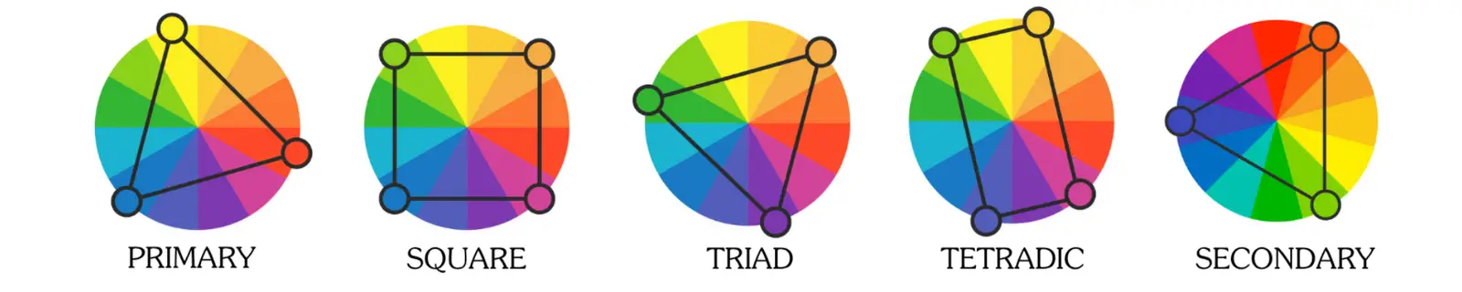
The color wheel shows how colors relate to each other.
- Primary colors = The foundation of all colors (cannot be made by mixing other colors). Red, blue, yellow.
- Secondary colors = Made by mixing two primary colors (Red + Yellow = Orange, Blue + Yellow = Green, Red + Blue = Purple)
- Tetradic colors = Made by using two pairs of complementary colors, forming a rectangle on the color wheel (Green + Orange and Pink + Blue).
- Square colors = Four colors evenly spaced around the color wheel, creating contrast but keeping the palette balanced (Green, Orange, Pink, Blue).
- Triadic colors = Three colors evenly spaced on the color wheel. Balanced and vibrant (Orange, Green, Purple).
Knowing where colors sit on the wheel helps you mix and match colors that actually work together.
2.2. What Do Value and Saturation Mean?
When people talk about a color being too bright or too dull, they’re really talking about its value or saturation.
- Value = How light or dark that color is.
- Saturation = How vivid or muted the color appears.
A soft sage green and a bright emerald green share the same hue (color) but differ in value and saturation. Learning this helps you understand why some greens feel calm while others feel energizing.
Value of The Color Blue

Saturation of The Color Blue

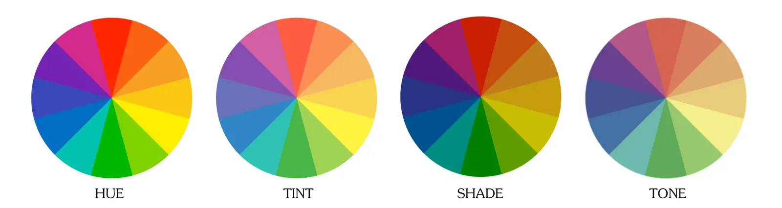
2.3. What Are Hues, Tints, Tones and Shades?
There are lots of different terms to know about, but it’s important to know in order to understand how you can decorate with colors.
- Hue = The actual color (like red or blue).
- Tint = When you add white to the color (pastel effect)
- Tone = When you add grey to the color (softens the color)
- Shade = When you add black to the color (makes it deeper and moodier)
By knowing these differences you will have easier to create a room that feels both layered and dynamic, instead of flat.
3. The Different Color Schemes You Should Know About
You know now the basics terms when discussing colors, but you also need to understand the different color schemes. These will help you mix colors with confidence.
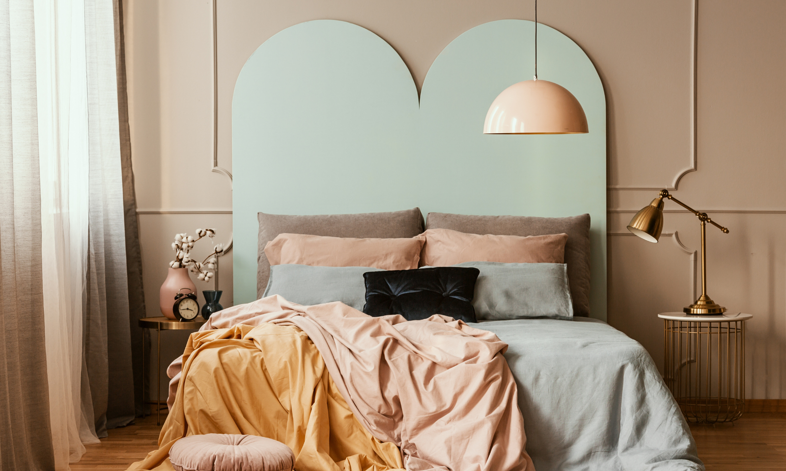
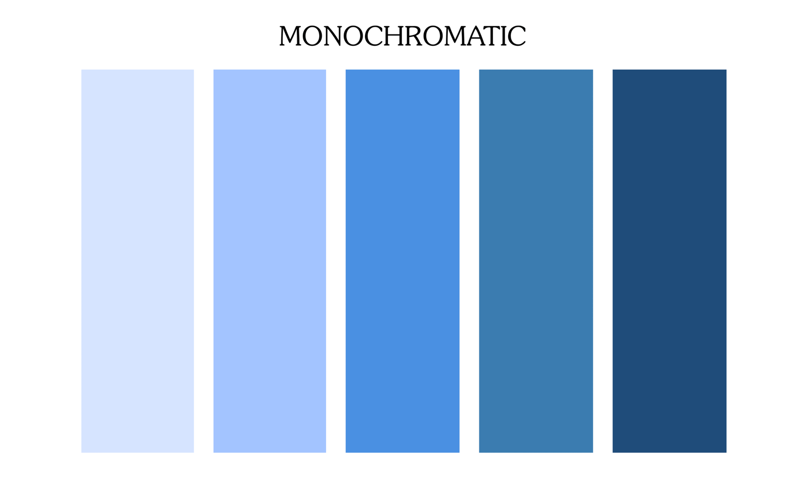
- Monochromatic = This is when you use one hue in different tints and shades. For instance, a lavender wall, lilac bedding and deep plum cushions. (Elegant and easy)
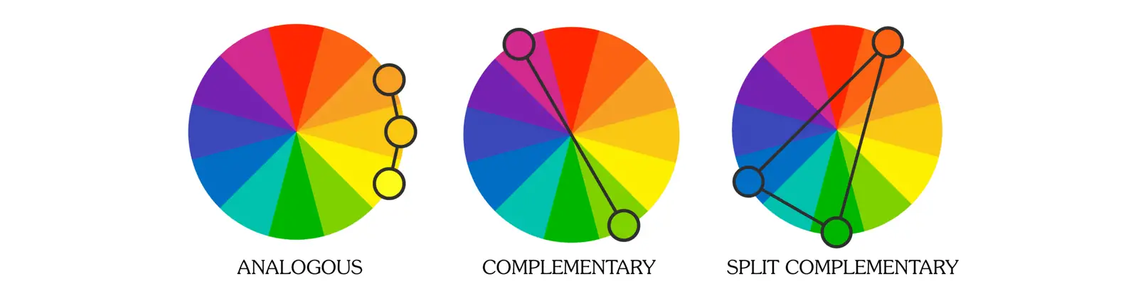
- Analogous = This is when you use three colors next to each other on the color wheel. For instance, green, teal and blue. (Fresh and harmonious)
- Complementary = This is when you use colors opposite on the color wheel. For instance, blue and orange, red and green. (Contrast and energy)
- Split Complementary =
I will insert a picture that will make these color schemes easier to understand, but also the tint, shade and tone.
4. Warm vs Cool Colors (And How To Balance Them)
One of the easiest ways to understand color is to divide it into warm and cool tones.
Warm colors include reds, oranges and yellows. They bring energy, coziness and a welcoming feeling to a space.
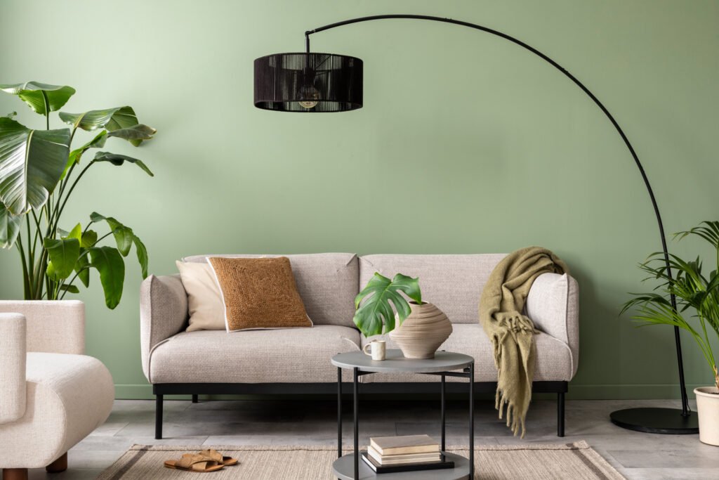
Cool colors, on the other hand, are blues, greens and purples. These shades tend to feel calm, refreshing and soothing.
This might be easy to understand and apply when decorating, but you still need to find the right balance between the two. If you use 100% cool colors, the room might feel a bit sterile or uninviting. And if you go all-in with warm colors, it can start to feel overwhelming or heavy. The key is to mix them so that you create a balance between them.
4.1. Rule of Thumb
A simple rule of thumb is to use the 80/20 rule. This means that you should use about 80 % of one temperature and 20 % of the other.
I’ll give you an example: a coastal interior design tends to lean heavily toward cool tones, such as blue and crisp white. But to create a sense of balance, it also includes warm tones through natural wood elements, such as rattan furniture, oak floors or woven baskets. These small additions will make the space go from cold to warm and inviting.
The same goes of course when you have mostly warm tones, try introducing a few cool-toned textiles or artwork. It will make the biggest difference!
5. Color Psychology: How Colors Affect Mood
Now, let’s move on to color psychology, which plays a huge role in how your home feels. I find it fascinating how each color can influence our mood, but it’s true: every shade affects how you feel when you walk into a room.
There are a few general “rules” about how certain colors tend to make us feel. However, it’s important to remember that this isn’t the same for everyone. We all have our own associations with color. For instance, while red is often seen as an energizing color, it might make you feel calm, it all depends on what you connect that color with. That’s what makes it so special when you decorate with colors that mean something to you.
But let’s go through how each color is typically perceived and what kind of feeling it brings to a space:
- Blue → calming, great for bedrooms or bathrooms
- Green → balanced, refreshing, connects with nature
- Yellow → cheerful, perfect for kitchens or hallways
- Red → bold and energetic, best used in small doses
- Orange → cozy and social, ideal for living rooms
- Pink → comforting, soft, and warm
- White → clean and fresh but can feel sterile if overdone
- Brown and beige → grounding, stable, and timeless
If you think color psychology is interesting, I have a more in-depth post about this that you can check out here.
6. Building a Cohesive Color Palette for Your Home
We’ve now come to the fun part – how to use colors in your home. Because, just as much as we all might love color, it’s also important to keep a cohesive color palette in your home. This way it will keep your home flowing beautifully from room to room.
6.1. Start With Inspiration
When you’re first start to decorate with colors, it can be hard to know where to begin (at least I thought so). For a long time, I stood in front of paint swatches completely lost, wondering how anyone could just “pick a palette.”
But here’s the secret that changed everything for me: start with something you already love. It makes the whole process so much easier and so much more personal. It could be:
- A piece of art that makes you smile every time you see it
- A rug with colors that feel warm and grounding
- Even a beautiful wallpaper pattern that catches your eye
By choosing one object as your inspiration, you give yourself a foundation, a natural starting point. From there, you can pull out three to five colors from that piece and build your entire palette around it.
For example, if you start with an abstract painting, you might notice soft beiges, muted blues and a touch of terracotta within it. Those shades can become your wall color, your textiles or your accents, all harmonizing beautifully because they come from the same source.
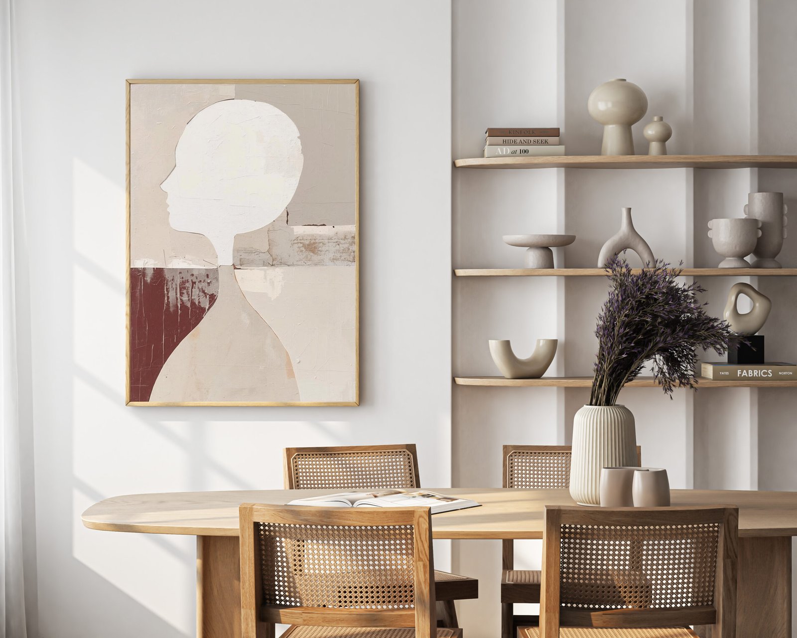
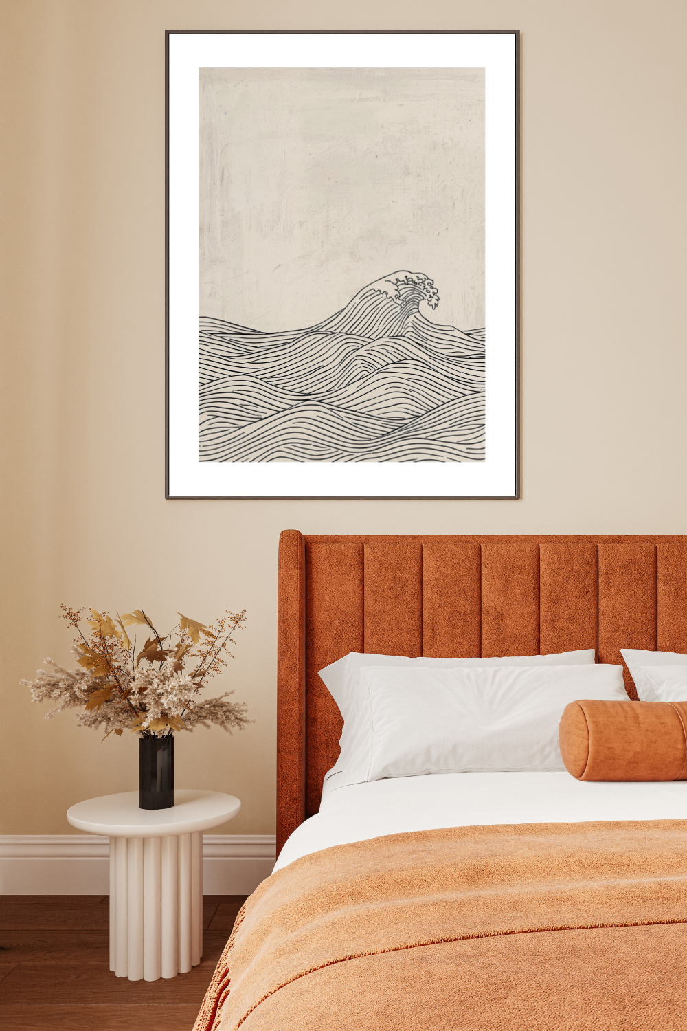
Let’s take this poster as an example, it has a very neutral color palette, but with touches of burgundy. A beautiful color palette to pair it with, would be beige, brown and small touches of burgundy.
6.2. The 60-30-10 Rule
There are actually one rule that will help you decorate with colors. This classic rule will keep things balanced and it’s the 60-30-10 rule. Let me explain:
- 60%: your main color (walls, large furniture)
- 30%: secondary color (textiles, curtains, smaller furniture)
- 10%: accent color (decor, art, cushions)
Repeating your chosen colors at least three times in a room makes the space feel intentional, not random.
6.3. Muted vs Strong Colors
There are a difference between muted and strong colors. When you decorate with muted colors (like dusty rose, olive green or smoky blue) you will create a calm and timeless atmosphere. However, strong or saturated colors (like royal blue or mustard yellow) will bring energy and drama.
So, when you decorate with colors, it’s best to mix the two. For instance, a muted clay wall with bright coral art.
7. Decorating With Neutrals and Colorful Accents
When you think of colors, you might think that you need to paint your walls in a bright pink, but that’s not the case. You can decorate with neutrals as well and still enjoy an interesting home.
7.1. Using Neutrals the Right Way
So, neutrals, such as beige, cream, taupe or grey, are actually the perfect foundation if you want to decorate with colors. However, you need o use them in the right way. For instance, mix warm and cool neutrals for interest and depth. Then, add textures and patterns to make them feel cozy.
7.2. Adding Pops of Color
But since you want to decorate with colors, you also need to add some of course. So, start introducing color through:
- Art prints or posters
- Throw pillows
- Curtains
- Plants
- Books or ceramics
If you want to start small, pick one accent color and repeat it in different saturations across the room. For example, soft blush, medium rose and deep terracotta together feel layered but cohesive.
8. Creative Color Techniques to Try
Let’s go though some different color techniques you can try.
8.1. Bold Wall Colors
Painting all walls in a rich color works beautifully in smaller rooms, like a study or guest bedroom. However, in open-concept spaces, it can be tricky to find a start and stop point for strong colors.
8.2. Accent Walls
Accent walls were everywhere a few years ago and they can of course still work. However, I’m not a huge fan of them since think they often break the flow. Instead, if you wnat that pop, try color drenching instead.
8.3. Color Blocking
This is a very cool technique. You divide your walls with geometric shapes or sections of different colors. This is great fo playful, colorful and modern interiors.
8.4. Color Drenching
When color drenching, you paint the walls, trim and even ceiling the same color. This will give the room a dramatic and enveloping feel. It’s also a huge trend in 2025 interior design and it really makes a small room fe
Paint the walls, trim, and even ceiling the same color for a dramatic, enveloping feel. This trend is huge in 2025 interior design — it makes a small room feel luxurious and cohesive.
9. What To Do If You’re Stuck With a Color You Don’t Like
Some of you might be renting an apartment or even a house, and you’re not allowed to change things like the color of your bathroom tiles or kitchen cabinets. I think we’ve all been there at some point — a rental with green cabinets or a beige carpet that completely clashes with your sofa.
The good news? There’s actually a simple trick to help you minimize the impact of those existing colors and blend them into a new color palette. After all, colors look completely different depending on what they’re paired with.
Let me give you an example:
Light blue (#5a90c0) and light green (#98b2b1)
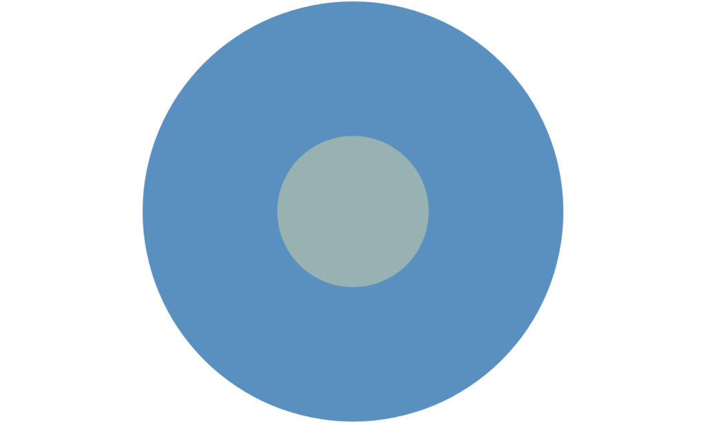
Dark teal (#13292a) and light green (#98b2b1)

Even though the color in the middle is exactly the same in both examples, it looks completely different depending on the background. Against the lighter blue background, the middle color appears softer and slightly muted, almost leaning towards a cool grayish tone.
But when placed on the dark teal background, the same color suddenly looks brighter, warmer, and more vibrant, almost like it has a subtle glow.
This simple visual perfectly shows how surrounding colors can transform how we perceive a hue. So, if you’re stuck with a color you don’t love, try introducing tones that either balance or neutralize it, you might be surprised by how different it starts to feel.
10. Interior Color Trends 2025
We’ve now discussed how you can decorate with colors, but let’s just do a little recap of what’s actually trending in 2025. We now see a beautiful shift toward comforting and grounded colors. For instance:
- Earthy browns and terracotta
- Muted greens (like eucalyptus or olive)
- Deep blues with grey undertones
- Warm neutrals with pink or clay undertones
- Soft buttery yellows and caramel tones
In 2025 we’re moving away from sterile grey minimalism and dive into interiors that feel full of life.
Final Thoughts
I hope you’ve learned something new about colors now. But I want you to remember that when you decorate with colors, it’s not about following strict design rules, it’s more about expressing who you are.
Start small, experiment and most importantly, trust your eye! If you love it, that’s reason enough to use it.
Don’t forget that I now design my own posters on Etsy. You can find them here.